
: Full Paint Guide")
Choosing a green paint sounds simple until you realize how many shades of sage, olive, and gray-green are out there. I’ve been in that same spot, trying to find a color that doesn’t feel too minty, too muddy, or too dark once it’s on the wall.
That’s exactly why I put this guide together: to help you decide if Sherwin-Williams Coastal Plain is the right shade for your home.
I’ll walk you through how it looks in real rooms, how it compares to other popular greens, and what colors pair well with it. You’ll also get tips on lighting, finish, sampling, and buying, so you’ll feel confident picking the perfect green. Let’s figure this out together.
: Full Paint Guide")
Sherwin-Williams Coastal Plain is a soft, nature-inspired green with a relaxed, coastal feel. This muted mid-tone green is ideal for creating a tranquil and fresh atmosphere, and mixes beautifully in beach-style homes, country cottages, or anywhere you want a subtle pop of color that still feels grounded.
Basic Color Profile
HEX code: #B7C3A6
LRV (Light Reflectance Value): 37
Color family: Mid-tone green with warm, earthy undertones
This shade is part of Sherwin‑Williams’Coastal Cool green palette, a collection designed to evoke peacefulness and renewal. It’s balanced enough to serve as a bold neutral or as a soft, soothing focal point, depending on your space and style.
Coastal Plain lands right in that sweet spot between airy and grounded. It adds personality without overwhelming your walls.
Undertones Explained
Coastal Plain carries yellow and gray undertones that give it a mossy, organic feel. These undertones keep the green from looking too minty or saturated and make it more versatile in both cool and warm settings.
- In natural daylight, especially from south-facing windows, you’ll notice a lighter, greener tone with slight warmth.
- Under soft white or incandescent lighting, the yellow-beige undertone becomes more noticeable, giving the color a richer, earthier look.
This shifting effect makes the Coastal Plain highly adaptable. It’s always a good idea to sample it in your space before committing, especially if your lighting changes throughout the day.
Coastal Plain in Real Spaces
SW Coastal Plain looks different depending on the room and lighting. Here’s how it usually behaves, so you can decide if it’s the right fit for your home.
How It Looks in Different Rooms
This soft green-gray paint is loved for its calm look and balanced tone. Whether inside or outside, it gives a steady, peaceful feel.
Living Room
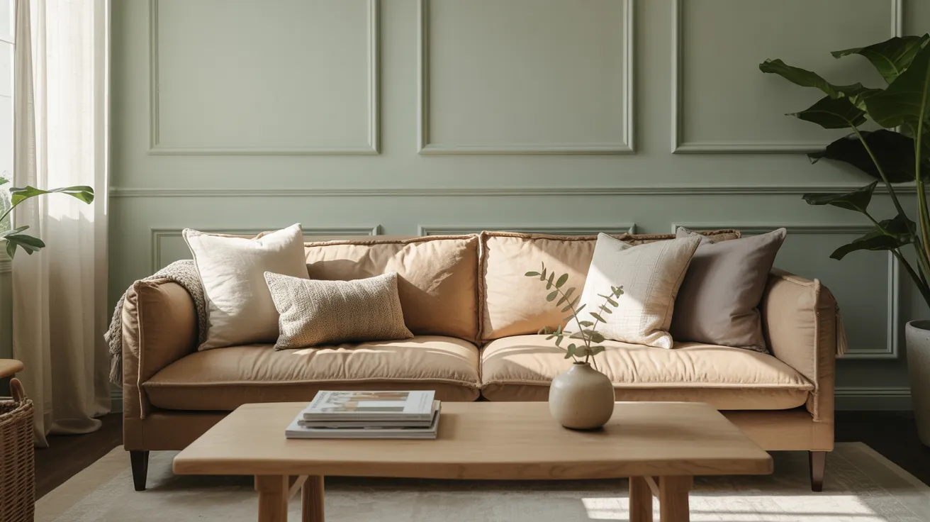
Coastal Plain in the living room creates a soft and easygoing space. It pairs well with white trim, beige or tan sofas, and natural wood.
The color doesn’t overpower the room. Instead, it adds just enough character to keep things interesting while staying gentle and relaxed for everyday use.
Kitchen and Cabinets
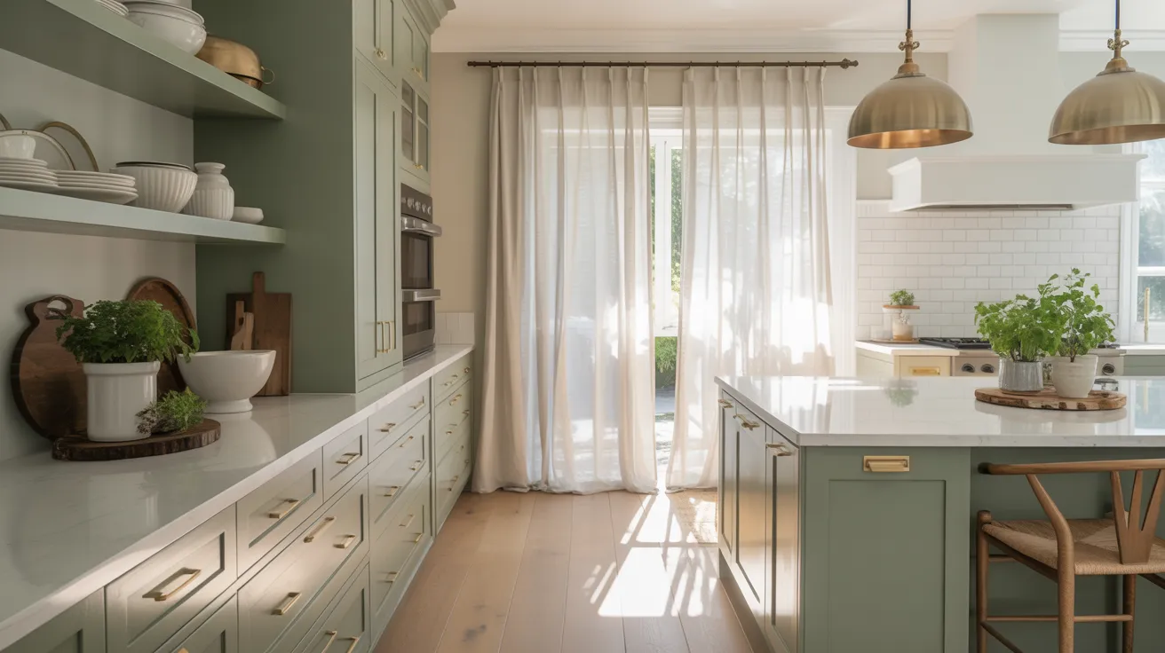
Using Coastal Plain on kitchen cabinets makes the space feel clean and relaxed. It brings in a cool, refreshing vibe without looking too cold.
Paired with white counters, gold or silver hardware, and light flooring, this shade keeps things tidy, soft, and pleasant in both small and large kitchens.
Bedroom Walls and Accents

This color works beautifully in bedrooms. It helps create a space that feels calm and quiet, perfect for rest. On full walls or just accent spots like behind the bed, it adds a soft touch.
Add light bedding, wooden nightstands, and soft lighting to complete the peaceful look and feel.
Exterior Siding and Doors
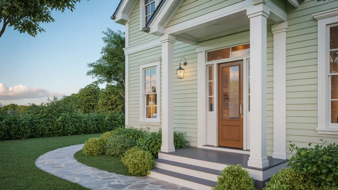
On exteriors, Coastal Plain adds a friendly, nature-inspired feel. It’s soft but still has color, so it stands out just enough.
Use it on siding, front doors, or shutters. It matches well with stone paths, white trim, and green yards. It fits nicely in both old and new home styles.
How Lighting Affects It
Lighting plays a huge role in how the paint looks. The same paint can shift tones depending on direction and time of day.
North-facing rooms: These get cooler light, so Coastal Plain may appear more muted with a stronger gray-green presence.
South-facing rooms: These are bright and warm, which can soften the color and bring out its earthy, slightly yellow undertones.
East-facing rooms: Morning light enhances its fresh green side; it can feel soft, clean, and airy early in the day.
West-facing rooms: In the evening, golden sunlight may highlight more warmth, bringing out subtle olive or beige tones.
Light changes throughout the day, so always test a sample on multiple walls and check it morning, noon, and night. That way, you’ll know exactly how it behaves in different lighting conditions.
Coastal Plain vs. Other Sherwin‑Williams Greens
Sherwin‑Williams has quite a few soft greens, and it’s easy to feel torn between them. Here’s how Coastal Plain compares to some of the most talked-about green shades from the brand.
Coastal Plain vs. Sea Salt
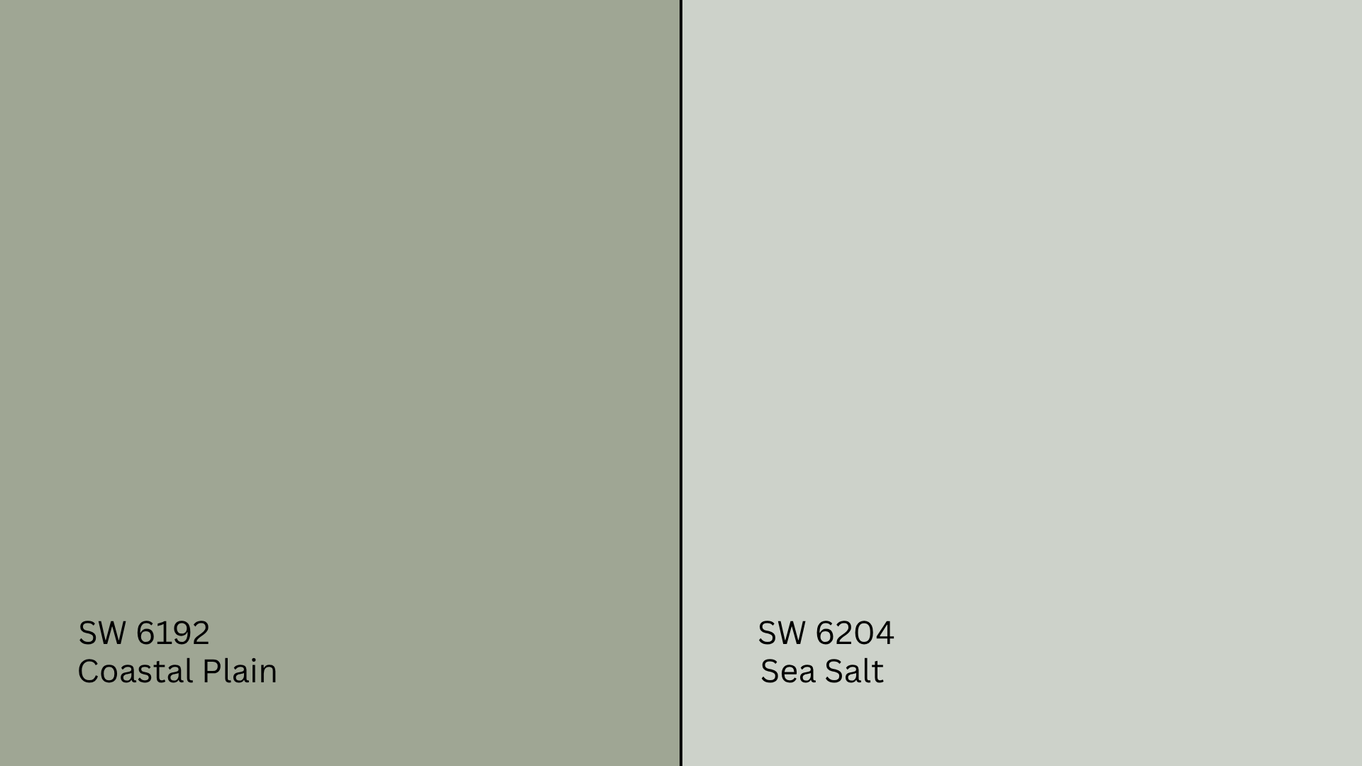
Sea Salt (SW 6204, #CBD2C0) is one of Sherwin‑Williams’ most popular green-grays. It leans much cooler and has more gray and blue in it than Coastal Plain.
- Sea Salt often looks almost like a soft gray-blue in low light.
- Coastal Plain stays greener and warmer, especially under natural light.
If you want a barely-there spa green, Sea Salt might be the better pick. But if you want a truer green that still feels calm and soft, Coastal Plain is a great choice.
Coastal Plain vs. Comfort Gray
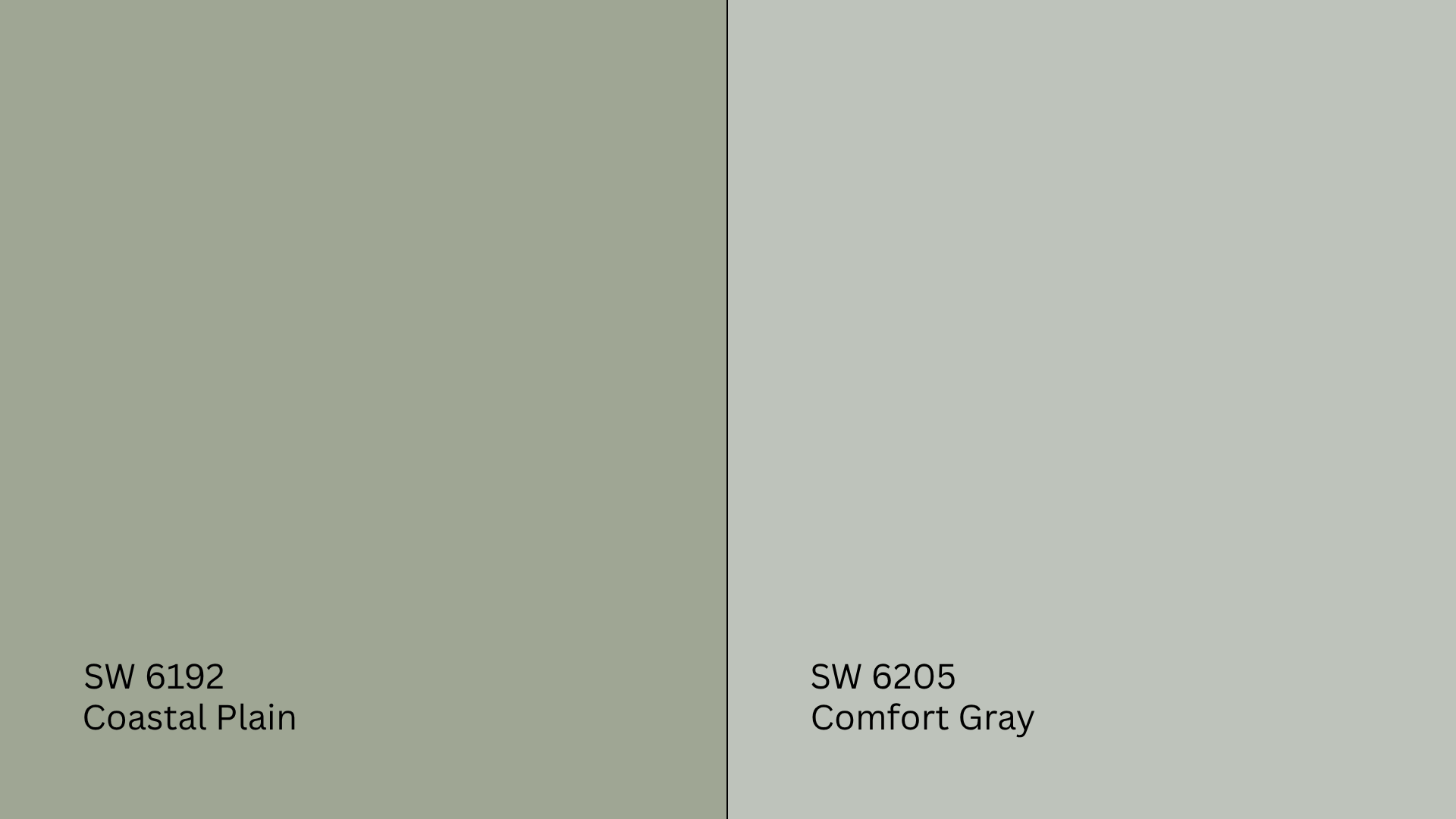
Comfort Gray (SW 6205, #BDC3B6) is a cooler, more saturated green-gray. It’s part of the same color family as Sea Salt but has stronger blue undertones.
- Comfort Gray often leans more blue, especially in cooler light.
- Coastal Plain holds onto its green warmth and feels more natural and earthy.
If you’re leaning toward a coastal or spa-like color with a bluish cast, Comfort Gray may work better. But if you’re after a softer, more grounded green, Coastal Plain will likely feel more relaxed.
Coastal Plain vs. Evergreen Fog
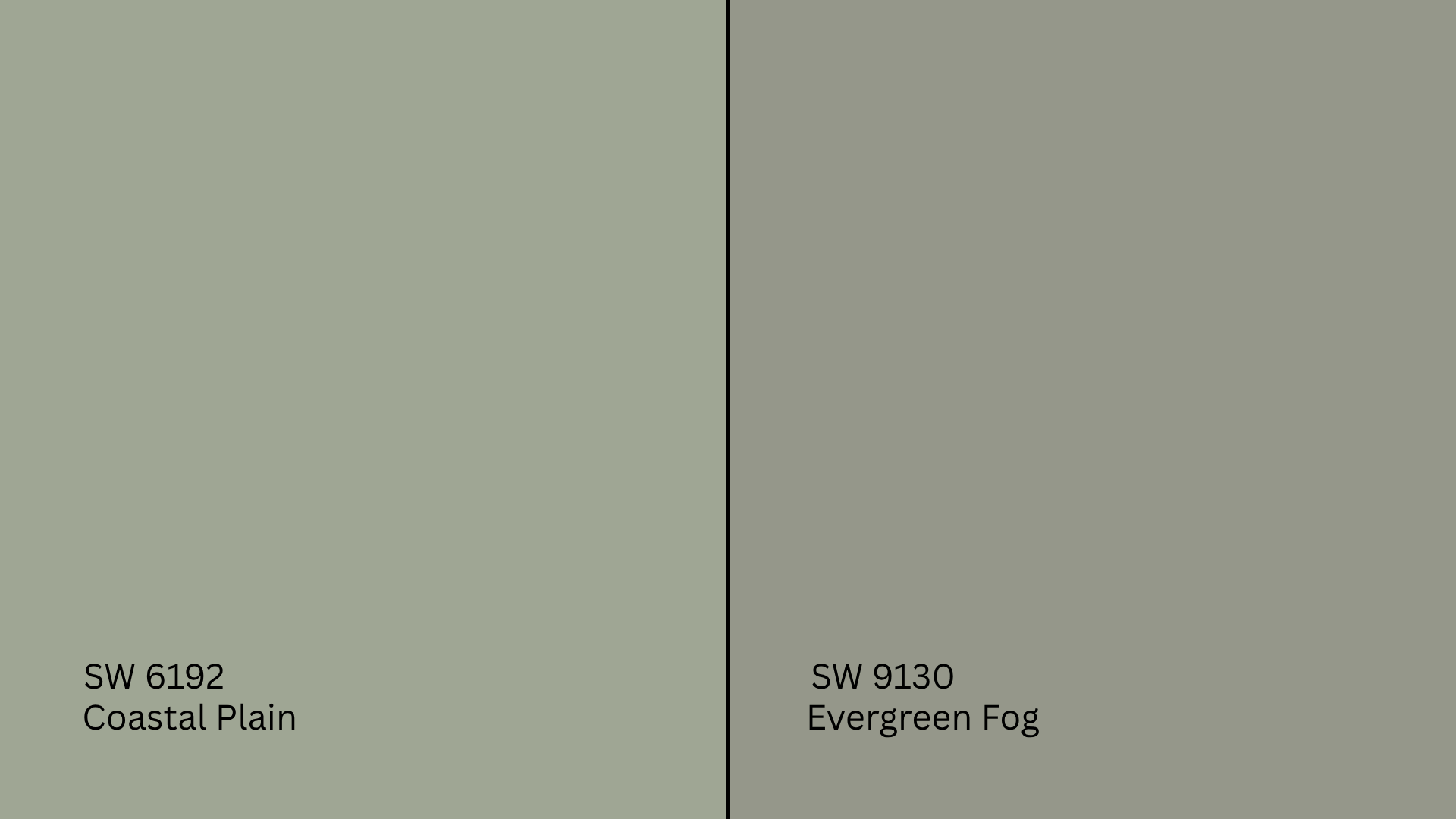
Evergreen Fog (SW 9130, #CBD0C2) was Sherwin‑Williams’ 2022 Color of the Year and is a much deeper, moodier green with stronger gray undertones.
- Evergreen Fog reads like a muted sage with a smoky feel.
- Coastal Plain is lighter and feels more refreshing and casual.
Choose Evergreen Fog if you want depth and drama. Go with Coastal Plain if you prefer a breezier, lighter green that still brings personality to a space.
Undertone and LRV Comparison Table
| Paint Color | Undertones | LRV | Warm or Cool |
|---|---|---|---|
| Coastal Plain | Yellow-gray green | 37.00 | Warm |
| Sea Salt | Blue-gray green | 63.00 | Cool |
| Comfort Gray | Blue-gray | 54.00 | Cool |
| Evergreen Fog | Gray-green | 30.00 | Cool |
All of these greens are loved for different reasons, but they’ll each behave differently depending on your room’s light. Sample them side by side to see which one truly fits your space.
Best Color Pairings for Coastal Plain
Coastal Plain is a soft, earthy green that feels fresh without being overpowering. It works beautifully throughout the home, but it really comes to life when paired with the right trim, accents, and finishes. Here’s how I like to build a cohesive, relaxed palette around it.
Trim and Ceiling Suggestions
Pairing Coastal Plain with the right white trim helps define the space and keeps it from looking too muddy. These white paints work especially well:
Pure White (SW 7005, #F8F8F6): A soft, clean white that doesn’t feel too stark. It complements Coastal Plain without fighting for attention.
Alabaster (SW 7008, #EDEAE0): A warm, creamy white that adds just enough contrast while keeping the overall feel cozy.
Extra White (SW 7006, #F4F4F4): For a crisper, more modern contrast, this cool-toned bright white works great on trim or ceilings.
If you’re painting the ceiling to match the trim, stick to one of these in a flat or matte finish. It keeps the light balanced and soft.
Accent Wall and Furniture Colors
Coastal Plain gives you options. You can lean into a calm, natural palette or add contrast for a bit more personality.
For a soft, layered look, pair it with warm whites, soft tan, clay pink, or dusty lavender. These colors add warmth and dimension, especially in bedrooms or living areas where you want things to feel grounded and serene.
If you’re going bolder, try navy blue, charcoal gray, aged bronze, or even a deep terracotta. These shades pop against the sage backdrop and can give your space a more modern or collected feel.
When it comes to furniture, light oak, rattan, off-white, or oatmeal-toned upholstery keeps things breezy. But don’t be afraid to mix in a vintage wood dresser, a navy accent chair, or even a weathered leather piece to create balance.
Hardware and Flooring Compatibility
I’ve noticed that Coastal Plain works well with all kinds of finishes, but the right flooring and hardware can highlight its natural beauty even more.
For hardware, brushed brass adds warmth and complements the earthy green nicely. If you want something more crisp and contemporary, polished nickel or chrome offers a clean finish. Prefer contrast? Matte black makes the green pop and adds a bold edge to modern spaces.
When choosing flooring, white oak or light maple keeps the room feeling fresh and airy. Medium-toned woods like hickory or walnut bring in warmth and balance. For tile or stone, go with warm gray or soft greige to echo the undertones and create a cohesive look.
No matter what you choose, always test everything together in your space. Coastal Plain is subtle, but it responds to light, texture, and nearby colors in surprising ways.
Paint Finish Recommendations
I’ve learned that the finish you pick doesn’t just change how durable your walls are—it also changes how Coastal Plain shows up in your space. Each finish interacts differently with light and can shift how the color feels in a room.
Matte is great for low-traffic areas like ceilings or guest rooms. It hides imperfections and gives Coastal Plain a soft, velvety appearance. The green feels more muted in this finish, especially in shaded or low-light spaces.
Eggshell works well in living rooms, hallways, or home offices. It has a slight sheen that reflects light without drawing too much attention to the wall texture. This finish keeps Coastal Plain feeling calm but adds just a touch of energy.
Satin is perfect for kitchens, bathrooms, and high-use areas. It’s durable, easy to clean, and holds up well in moisture. The subtle shine can bring out Coastal Plain’s yellow or gray undertones, especially under bright lighting.
If you’re unsure which finish to choose, try a test swatch in different areas of your room. Lighting and wall texture can shift things more than you’d expect; sampling is always worth it.
Sampling and Buying Options
Before you commit to a full gallon, it’s smart to test Coastal Plain in your actual space. Room size, lighting, and nearby colors can all influence how the color looks once it’s on the wall.
Where to Get Peel-and-Stick Samples
The easiest way to try Coastal Plain without making a mess is to use peel-and-stick samples.
- Samplize provides real Sherwin-Williams paint on adhesive swatches. They’re removable, reusable, and won’t damage your walls.
- Local hardware stores may carry Coastal Plain in small sample pots or color chips.
- Sherwin-Williams stores often offer painted sample cards and 8-oz. tester jars for brushing onto your walls.
Stick samples on multiple walls and view them throughout the day to see how the undertones shift with different lighting.
Where to Buy the Paint
You can buy Sherwin-Williams Coastal Plain online or in-store.
- Sherwin-Williams.com allows direct ordering with store pickup or home delivery.
- Authorized retailers often carry Coastal Plain in multiple finishes and sizes.
- Big-box hardware stores may be able to tint it for you using Sherwin-Williams formulas.
- Some stores also offer curbside pickup or home delivery. Just check availability in advance.
Paint Equivalents in Other Brands
If you don’t have access to Sherwin-Williams paint nearby or you’re trying to color-match in another brand, I’ve found a few similar alternatives to Coastal Plain. Just keep in mind that each brand uses its own base and formula, so undertones and finishes might shift slightly.
Benjamin Moore: Try Saybrook Sage (HC-114, #B9B89A) or Soft Fern (2144-40, #C7C8A3) for earthy green tones that lean soft and muted.
Behr: Look at Nature’s Gift (MQ6-45, #A7B6A0) or Pale Cucumber (PPU9-17, #D6D5BC) for gentle sage-like greens with a similar calm vibe.
These shades can get you in the ballpark, but it’s always a good idea to sample them side by side. Even a small change in base or sheen can shift how the color feels once it’s on your wall.
Final Thoughts
If you’ve made it this far, you’ve got a clear idea of whether Sherwin-Williams Coastal Plain (SW 6192) is the right fit for your space.
You’ve seen how it looks in different lighting, how it reacts to various finishes, and which colors, trims, and materials bring out its best.
Now, shopping for paint or ordering samples should feel a lot simpler. Just remember: always test it on your own walls. Light and surroundings can shift the look more than you’d expect.
Still browsing for greens or soft neutrals? Check out my other paint breakdowns; they’re just like this one and are designed to help you choose with confidence.